Internal reference:
Free images: https://unsplash.com/ https://www.pexels.com/
Hex Code: https://www.color-hex.com/
Color contrast check: https://webaim.org/resources/contrastchecker/
Color wheel: https://www.figma.com/color-wheel/
QR Generator Code: https://qrcode.tec-it.com/en/MeCard
Alternative to Figma: https://www.canva.com/
Stick to Web Content Accessibility Guidelines (WCAG): https://www.w3.org/WAI/tips/designing/
https://www.dailyui.co/ Become a better designer in 100 days – daily challenges.
https://medium.com/ stay curious
Accessibility: https://www.springboard.com/blog/design/accessible-design/
User-centered design: https://www.usability.gov/what-and-why/user-centered-design.html
Statistics: https://www.statista.com/
Google’s design system: https://m3.material.io/
https://material.io/blog/science-of-color-design
https://m2.material.io/resources
Accessibility (size of icons): https://m3.material.io/foundations/accessible-design/accessibility-basics
https://accessible-colors.com/
Apple’s iOS: (design philosophy) https://developer.apple.com/design/human-interface-guidelines/
Google’s Android: (design philosophy) https://m3.material.io/
Figma design file: Smart Animate: https://www.figma.com/community/file/767122733527420957
Check out the advanced prototyping playground file → Design Systems: https://www.designsystemsforfigma.com/
Design Systems: https://www.designsystemsforfigma.com/
Free wireframing tool: https://www.justinmind.com/free-wireframe-tool?utm_source=wisepops&utm_medium=blog&utm_campaign=wireframing_tool_popup_center_layout_1
Persona Template:
https://docs.google.com/presentation/d/10a72PKWsZnsXqmERb0qtX-3v9W4VDILFtz0_PudX52I/template/preview
Accessibility tips on your phone: https://www.uswitch.com/mobiles/guides/smartphone-accessibility/
User Journey Map: Template: https://docs.google.com/presentation/d/1dg6-AsYF0EHG8YC2xSJ12Cw3XoJg0LjAfFv77THauZw/template/preview
Template for Hypothesis Statement: https://docs.google.com/presentation/d/1FQ_kIibfMslW84W4SsSCcXS-pojepUBc6f0ehvzig00/template/preview
https://www.toptal.com/product-managers/freelance/product-designer-guide-to-competitive-analysis
Competitive Audit Template: https://docs.google.com/spreadsheets/d/1LVg_P5m-BkbHq_bc6_chsXOjpCgHicccRrvBwnau5y0/template/preview?resourcekey=0-JvbWRktWTVmeAPI2Mx2q9Q
Report Template: https://docs.google.com/document/d/1PR1TfbyJLiBaYDkDpuKY9IR6OeSMmwLGll0XhPxN0Q4/template/preview
Goal statement template: https://docs.google.com/presentation/d/1IQKfPj_N9z7SzfurrXHvxlyek8bGGdvWF8szqyLlrXs/template/preview
User Flow: https://miro.com/welcome/R3NOenBPb0pZeVdKNWZkRFhJU1NyUm8yRFI0UmNQeGJpZHBsQ3VHTVRqbVhPa1ZhVGpNTFR3aDJLZ05hVWVuVnwzNDU4NzY0NTQ4MjA3ODM0NzQ2fDQ=?share_link_id=72166393599
Storyboard template: https://docs.google.com/presentation/d/135qtZ8ERI7Ldbt8q9rt_ZHsCwKnbyNJRyX1AY2YxV5E/template/preview
Ideas for six slides:
- Attention:
- Interest:
- Desire:
- Action:
- Onboarding:
- Retention
Use https://accessible-colors.com/ to determine if your color combinations are accessible or not.
How to organize information: https://www.justinmind.com/wireframe/information-architecture-ux-guide
Tools of IA:
- Pen and paper
- Pen and paper is all too often underused, although it is very cheap, simple to use, and effective.
- Realtimeboard.com
- Cheap and easy to use, Realtime Board is my daily go-to tool. You can use it to create charts, agile boards, customer journeys, personas, empathy blueprints, mind maps, organizational charts and more. Its focus is in supporting collaboration and offers good integration with Slack, Jira, Google drive, Dropbox…
- Lucidchart.com
- Lucid chart is a flowchart maker and online diagram software. They offer different sorts of charts and diagrams, and support creation of mind maps, and wireframes. Their price for a single user is low. They are a competitor to Miro (above).
- Xmind.net
- Xmind is a mind mapping web software that offers mind mapping, business charts, and brainstorming support. With your purchase you also get free templates, clip arts, a useful presentation mode, and more. (Structural approach to creativity.)
- Coggle.it
- Simplest of all 5, except for the pen and paper, Coggle’s collaborative mind maps web app is definitely a good choice if you need to get lots of people involved, and collaborate to create useful diagrams.
Websites and articles about information architecture
- Creating a website information architecture – dynomapper.com
- Information architecture process: how to create the best UX – bluefountainmedia.com
- The ultimate guide to information architecture – webdesignerdepot.com
- Improving information architecture: card sorting beginner’s guide – smashingmagazine.com
- Navigation IA tests – nngroup.com
- User Interface Engineering website – uie.com
- Eight principles of IA by Dan Brown – asis.org
- The high cost of not finding information – utoronto.ca
- IA vs navigation – nngroup.com
- Understanding information architecture – prezi.com
figma.com/community
Marvel’s Prototyping on Paper (POP): a tool for digitizing your drawings. https://marvelapp.com/pop Free: SB2@G TF1
- Metrics: Using metrics incorrectly or unethically to drive traffic. Design ethicist Tristan Harris has discussed this topic in his TED talks. https://www.youtube.com/results?search_query=tristan+harris+ted+talk
UXR Template: https://docs.google.com/document/d/1toX54uaOnCQPPjAb1-a7QPRzpgg1aAt6oezOEjnyjQQ/template/preview
Screener survey: https://www.userinterviews.com/ux-research-field-guide-chapter/screener-surveys
Screener surveys are important!
Hubspot: https://blog.hubspot.com/marketing/usability-testing
Spreadsheet notetaking template: https://docs.google.com/spreadsheets/d/19tX0mwTMXDerENn4Ucr71fxT2A6UZ3QjJ4tVVPWm1FI/template/preview
Sticky note tools:
- Jamboard (http://jamboard.google.com)
- Miro (https://miro.com/)
- Notely (http://note.ly/#)
- Mural (https://www.mural.co/)
- Padlet (https://padlet.com/)
Pattern Identification Template: https://docs.google.com/document/d/11XK05xs8H6z96-dKHGbxFrly1wozaRZWbRu_8niU6qk/template/preview for example:
Prioritized insights template: https://docs.google.com/document/d/19ECdfBzE2azhzo3966OhTONdL-QIN6-RO5IbGK7JqJg/template/preview
digital note-taking app
- Miro (https://miro.com/)
- Notely (http://note.ly/#)
- Unable to access
- Mural (https://www.mural.co/)
- Collaborative notetaking. P.W at SB2: I.B. Business intelligence
- Padlet ( https://padlet.com/)
- Jamboard (https://jamboard.google.com/)
If you’re a UI designer looking to gain immediate color confidence, start with ctrlpaint.com, a website dedicated to digital painting instruction.
https://www.shutterstock.com/blog/color-symbolism-and-meanings-around-the-world
Google’s Material Design page, has a list of free icons that are available for anyone to use. Click on Resources. At the top of the page, icons are listed under popular resources. https://m3.material.io/ https://fonts.google.com/icons
https://medium.com/ under Google/SB2.
Understand accessibility. https://www.springboard.com/blog/design/accessible-design/
Predictive search: https://www.justinmind.com/blog/how-to-design-an-awesome-predictive-search/
Navigation patterns:
- Hamburger menu
- Tabs (bottom of mobiles)
- Vertical navigation menus
- Breadcrumbs (Ex: Food / Breakfast & Cereal / Cereal)
- More: https://www.justinmind.com/ui-design/patterns
Polaris.shopify.com Design
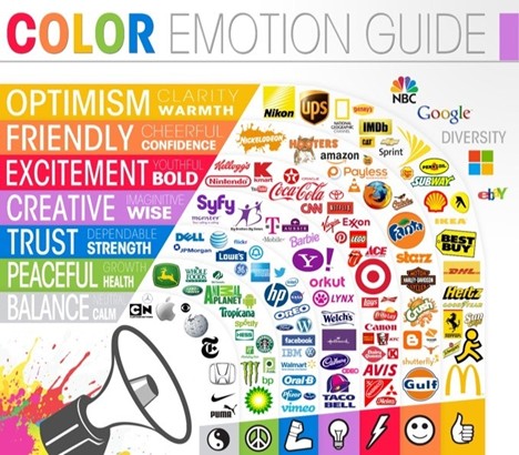
Color psychology: https://userpeek.com/blog/what-is-color-psychology-in-ux/
Variants help organize components and improve the design experience. Guide for best use: https://help.figma.com/hc/en-us/articles/360056440594
How to create buttons in Figma: https://nivaaz.medium.com/how-to-create-basic-buttons-in-figma-d47a6838d8bb
Want more Figma Tips? Figma tips and resources, every other Friday! The UI Prep newsletter: https://www.uiprep.com/newsletter
Real life sticker sheet: http://www.lisasuefischer.com/#/thrive/
(Examples of case studies)
Design Systems:
To find and import design systems in Figma, go to the Community section and scroll through the options. Or, search for a design system from a brand that you’re a fan of. When you find one you like, click Duplicate to save a copy to your Drafts folder. You can utilize elements and components from that design system in no time! As you start to explore the Community section, there are a handful of UI kits that you might want to check out or download:
- Google Material Design
- Shopify Polaris
- Microsoft Fluent
- Salesforce Lightning
- Atlassian Design System
- Uber Base Web
- IBM: https://carbondesignsystem.com/?ref=designerup.co
- Mailchimp: https://ux.mailchimp.com/patterns/color?ref=designerup.co
- Salesforce: https://www.lightningdesignsystem.com/?ref=designerup.co
- Helpscout: https://style.helpscout.com/?ref=designerup.co
Zeroheight: A documentation website. https://zeroheight.com/ They have an integration with Figma. Zeroheight creates a central hub for designers, engineers, product and marketing teams. Connect everyone with your design system and make your whole org happier.
DesignSystemsForFigma.com for design kits
How to write a UX case study | Inside Design Blog (invisionapp.com)
Template: https://docs.google.com/presentation/d/1zyqoc1125wnStwfpGwhmJw0PAjtr9-Dt7i0o7a7DYGw/template/preview
GET TO KNOW USER EXPERIENCE DESIGN: How to describe UX: What and why:
UX designers help make technology easier to understand and more enjoyable to use.
The user experience is how a person, the user, feels about interacting with or experiencing a product.
For a user to have a good experience, the product needs to be usable, equitable, enjoyable, and useful.
User experience is about improving usability or making something easier to use. This means that the design, structure, and purpose of the product are clear to everyone.
UX designers need to think about every person who uses the product. This might include people with disabilities, or people with very different life experiences from your own. Different levels of education.
Equitable design is key. Being equitable means your designs are useful and marketable to people with diverse abilities and backgrounds.
As humans, we want products that are useful, meaning they solve our problems.
In 2018, the research firm McKinsey & Company studied companies in three industries: medical technology, consumer goods, and retail banking. They found that, regardless of industry, businesses that focused on good usability and design performed better than their competitors.
When people like a product, they use that product a lot, and they recommended it to their friends.
And more people using the product means better business for the company. Plus, when users have a good experience with the product, they’re more likely to have a positive opinion of the company that made it. A win-win for the user and the business.
A lot of companies don’t understand the important role that UX design can play in improving their business, and that is where you as a UX designer come in.
Characteristics of a Good User Experience:
What exactly makes a product effective to its users? Simplicity, structure, functionality? It depends.
- Usable: The design, structure, and purpose of the product is clear and easy to use. Refers to the product working well and being easy to use. Is everything in the design easy to find? Is the design’s functionality easy to understand? Can users accomplish specific tasks within the design?
- Equitable: Helpful to people with diverse abilities, backgrounds, genders, race. Equity means providing people with the tools they need to accomplish their goals and support improved quality of life. Are the needs of a diverse group of users considered? Does the product’s design address the needs of traditionally underrepresented and excluded groups?
- Enjoyable: The design delights the user. It reflects what the user may be thinking or feeling and creates a positive connection with them. Are there aspects of the design that consider the user’s feelings? Does the design inspire delight in the user? Does the design keep the user engaged throughout their experience?
- Useful: Solving user problems. The design intentionally solves a user problem that the designer has identified. Refers directly to the ability to solve user problems. Does the design add value to the user’s experience? Does the design solve a problem for the user? Does the design help the user achieve a specific goal?
A good design:
- When you have to question whether something has been designed at all
- Economical; inexpensive and lasts forever
- Every element has a purpose
- Functional, low maintenance, intuitive, honest, long-lasting, inclusive, desirable
- Simplifies the complex
- Applying creativity that is considerate of others, in places where you do not expect it
- Can help us say or experience something deeply personal while remaining authentic and distinct
- Utilitarian, purposeful
- Healthy mix of the familiar and the future
- Simple, accessible and infallible
- Embraces its function, expressed so simply and effortlessly that it passes for common sense
- Simple and self-explanatory. No instructions needed
- Multi-purposeful, timeless, durable, accessible, multi-functional
- Durable, long-lasting, enduring
- Elegant and smooth synthesis of functions
- Has room for play, allows for new conditions and new solutions
- Useful, effective, simple, versatile
- Simplicity, structure, functionality
- Helps users avoid mishaps and roadblocks
Copious notes and reference material on this subject…
See also Chapter 24: